KUCDMFA_Studio516_Gilmore_Final_Final_Page_01.jpg

Paper Maps AREN’T DEAD.

READ ON TO KNOW WHY.

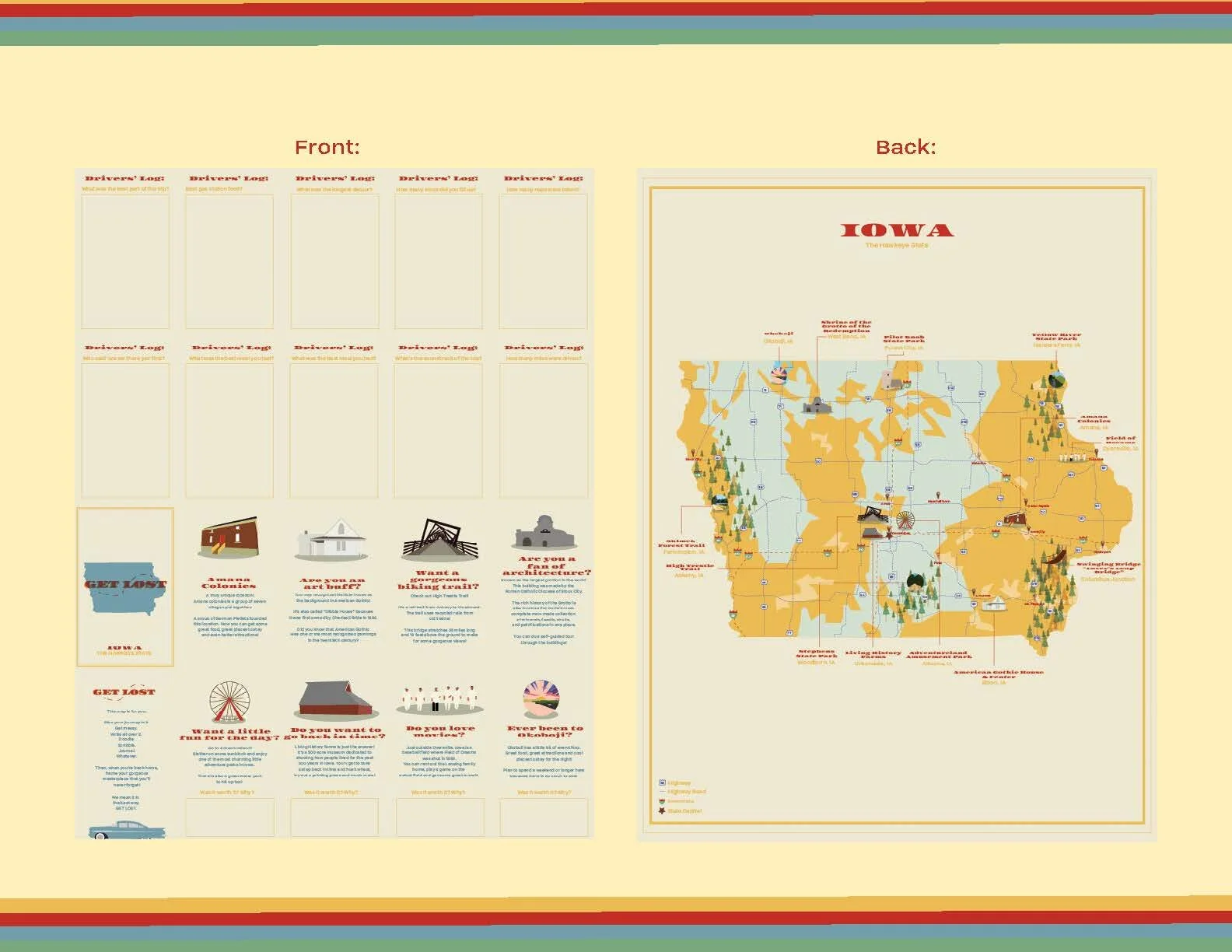
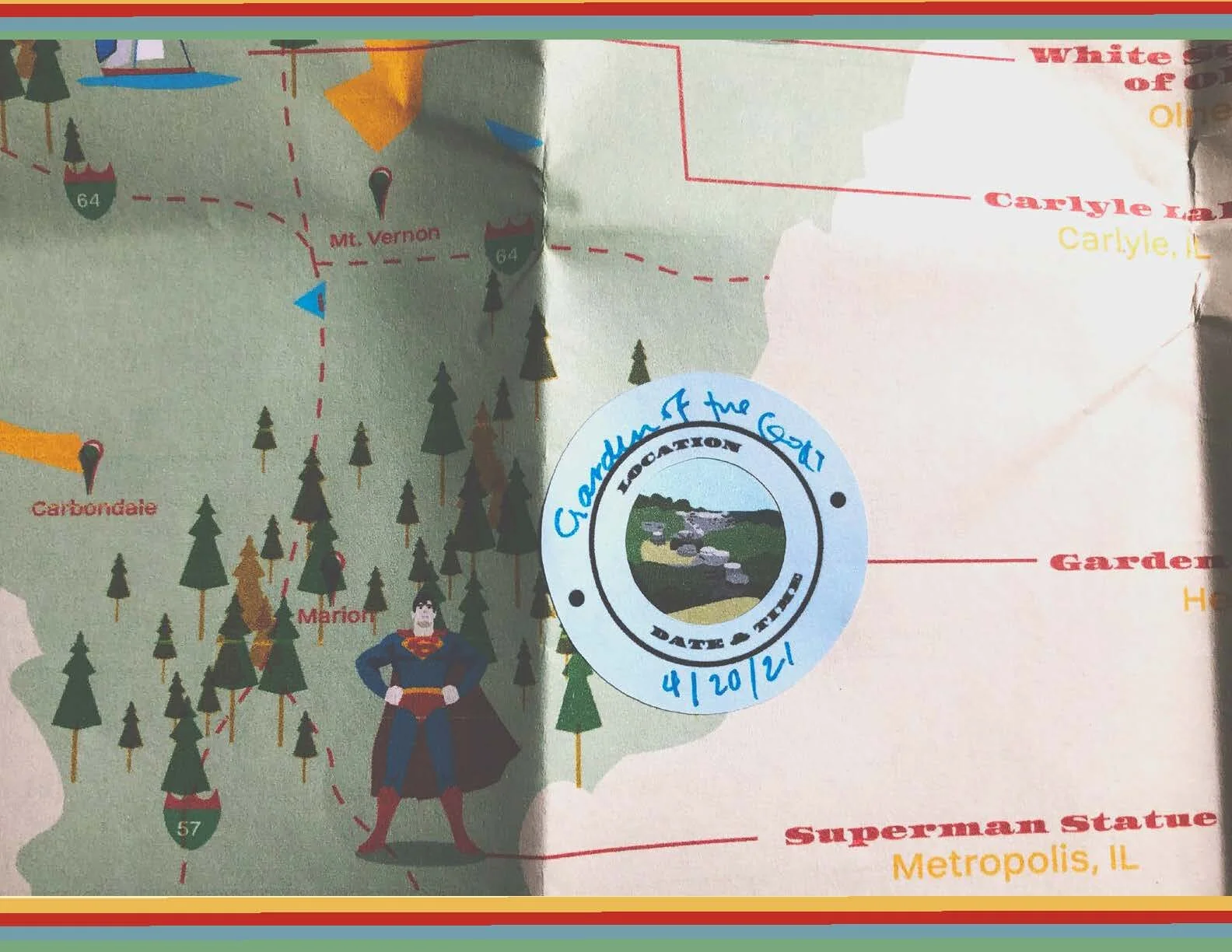
Paper maps are not going away. They just need a face lift. We don’t need them to take us somewhere, but they can be a way to take us on a journey! That is what this project is all about. I wanted to show how exciting maps could be for the future.

I focused on the midwest because in a lot of ways it’s the unsung hero of the United States. I chose my home state, Illinois to begin with and then worked my way to Iowa.


After laying out notecards on my living room floor and playing around with layout. I went into lucid chart and build out a wire frame based off of the user experience.
These are my initial sketches based off my wireframes. I liked the idea of using more visuals rather than text to keep it user friendly and simple.
From there, I picked out my color palette and brand identity! Something fun, poppin’ and really quite different from most budgeting apps.
I wanted to figure out how to play around with the words to get what I want. The magic of it was that the word “able” came from “accountable” so it clicked really well.

A lot of the preliminary part to this project was about researching and creating the experience I wanted the users to have.